2-Day design sprint
Chambers & Partners
Role
UX/UI Designer
Industry
E-commerce, Listing
Time
2019
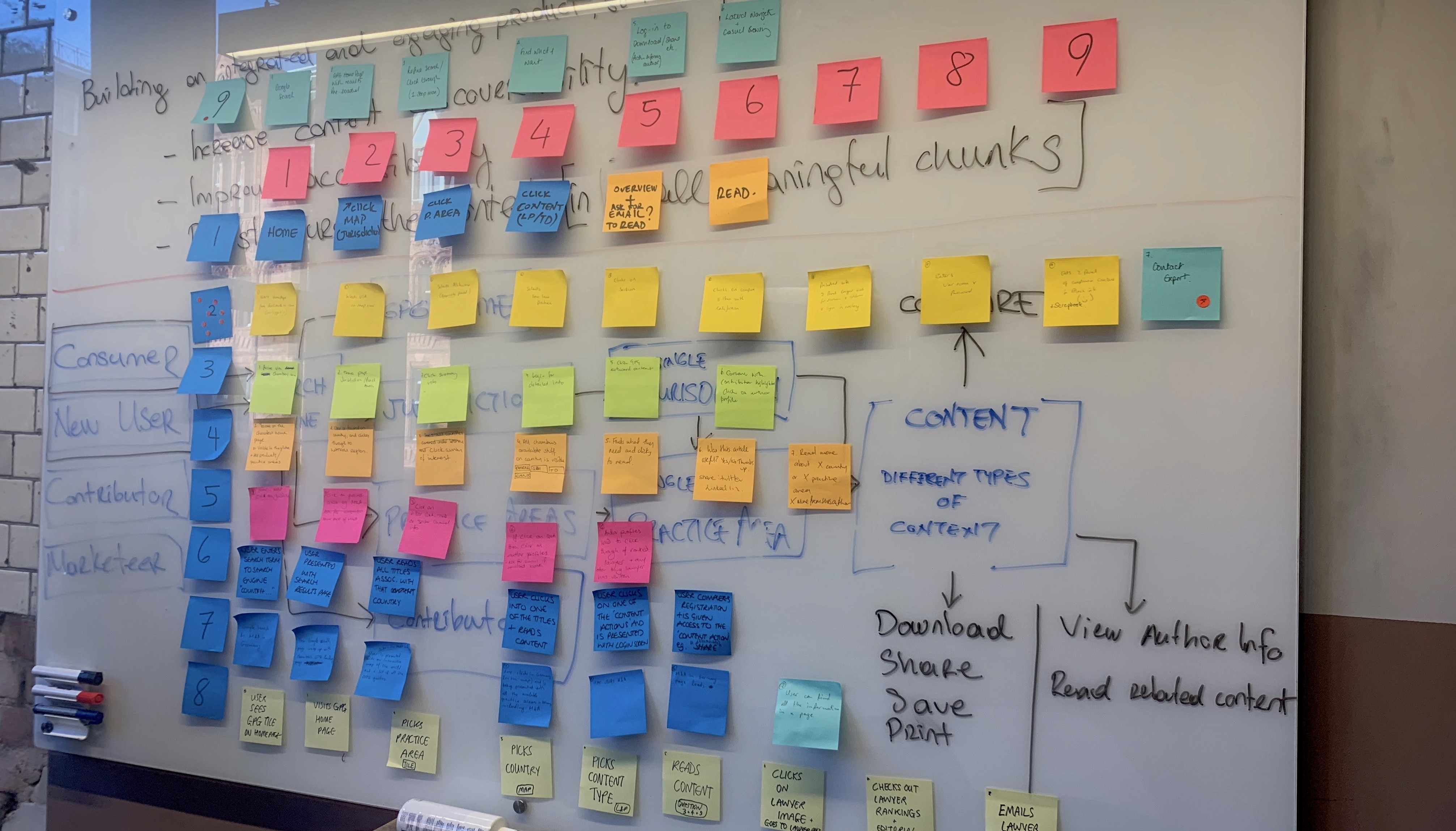


Our website has been live for some time, but user feedback and analytics indicate issues in terms of usability. To address this, we organised a 2-day design sprint with the primary goal of understanding and addressing key usability issues.
Our website has been live for some time, but user feedback and analytics indicate issues in terms of usability. To address this, we organised a 2-day design sprint with the primary goal of understanding and addressing key usability issues.
Our website has been live for some time, but user feedback and analytics indicate issues in terms of usability. To address this, we organised a 2-day design sprint with the primary goal of understanding and addressing key usability issues.




Day 1: Morning - "How Might We?" Exercise
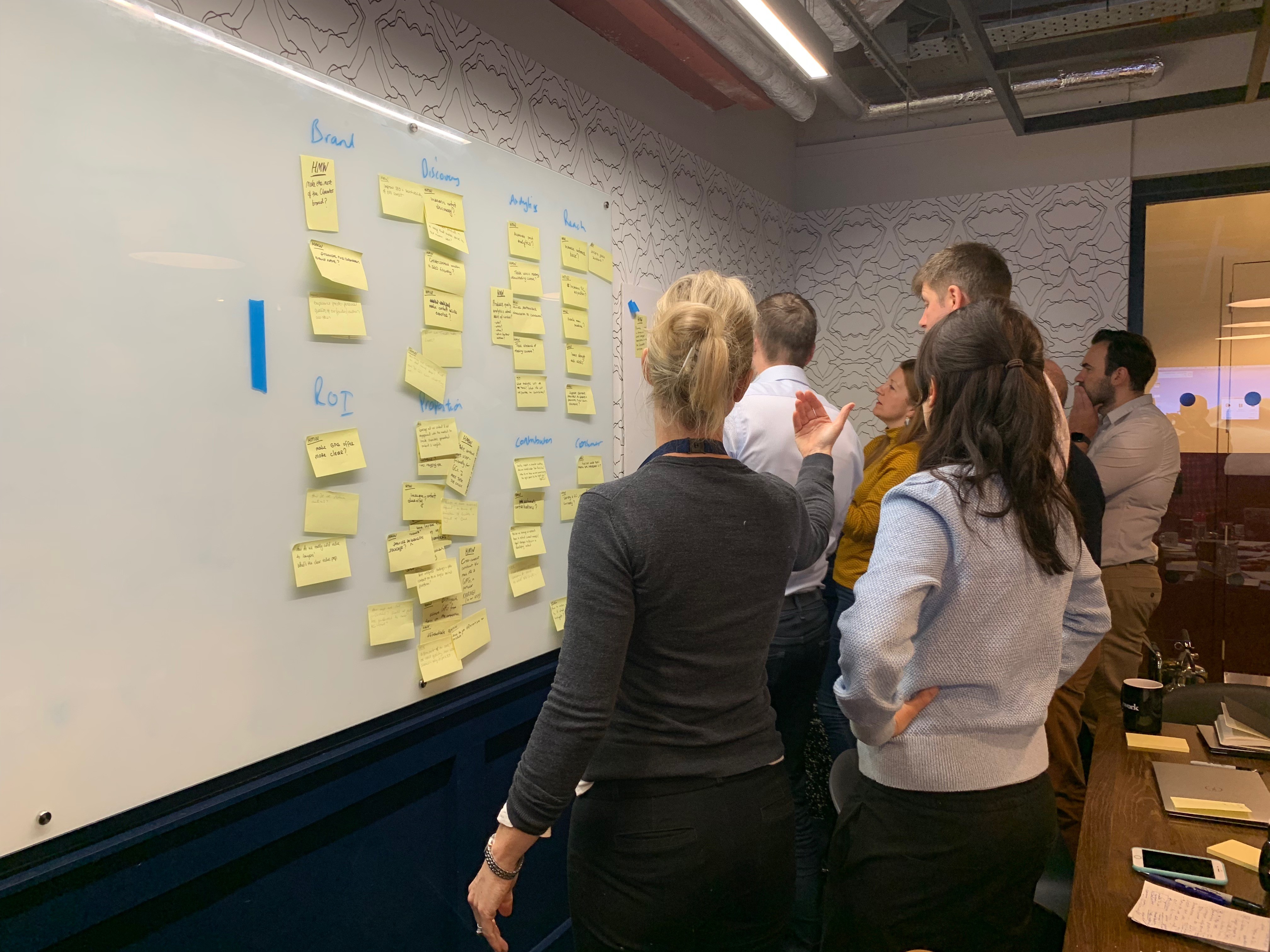
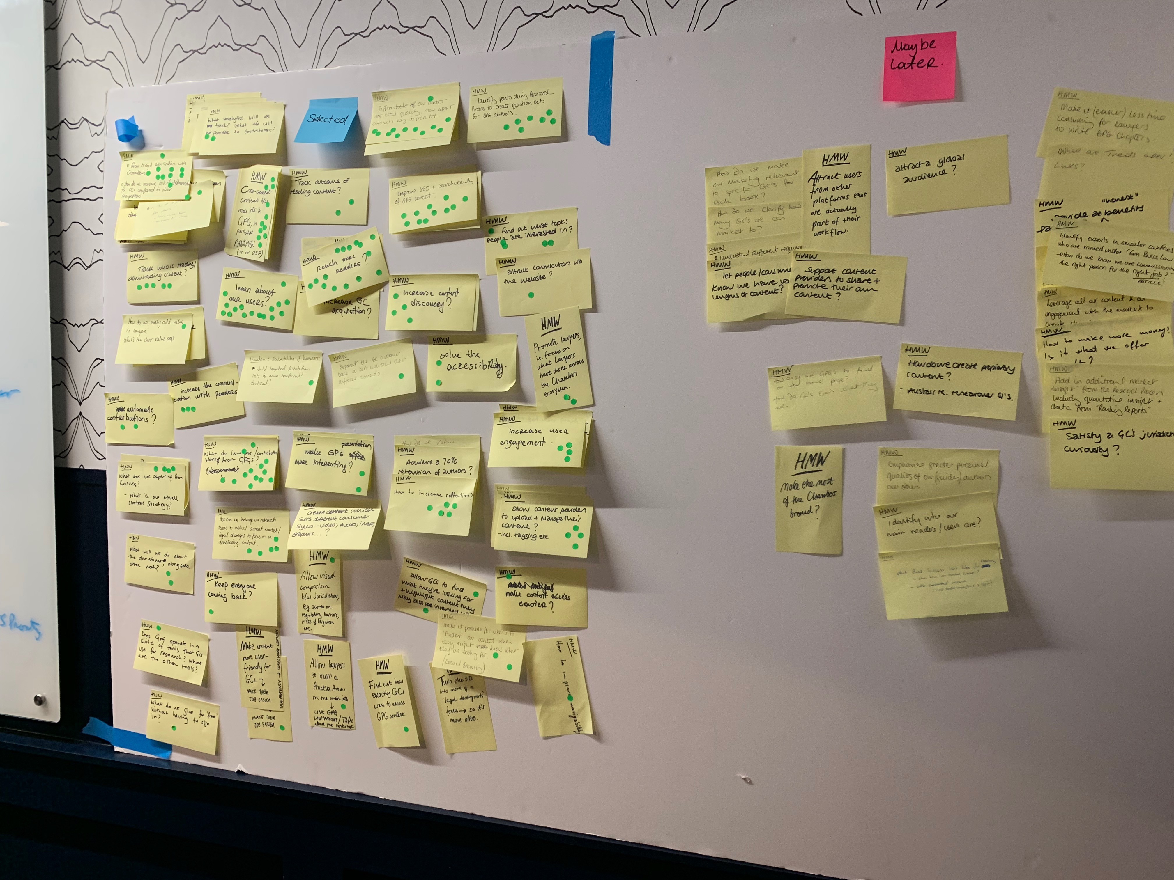
The first morning was dedicated to the "How Might We?" (HMW) exercise. This involved a collaborative discussion to identify pain points and opportunities for improvement. The team brainstormed by posing questions like "How might we simplify the onboarding process?" or "How might we make navigation more intuitive?" The goal was to generate a wide range of problem statements.
The output of this session was a consolidated and prioritised list of HMW statements, providing a foundation for the rest of the sprint.
Day 1: Afternoon - Quick Sketching
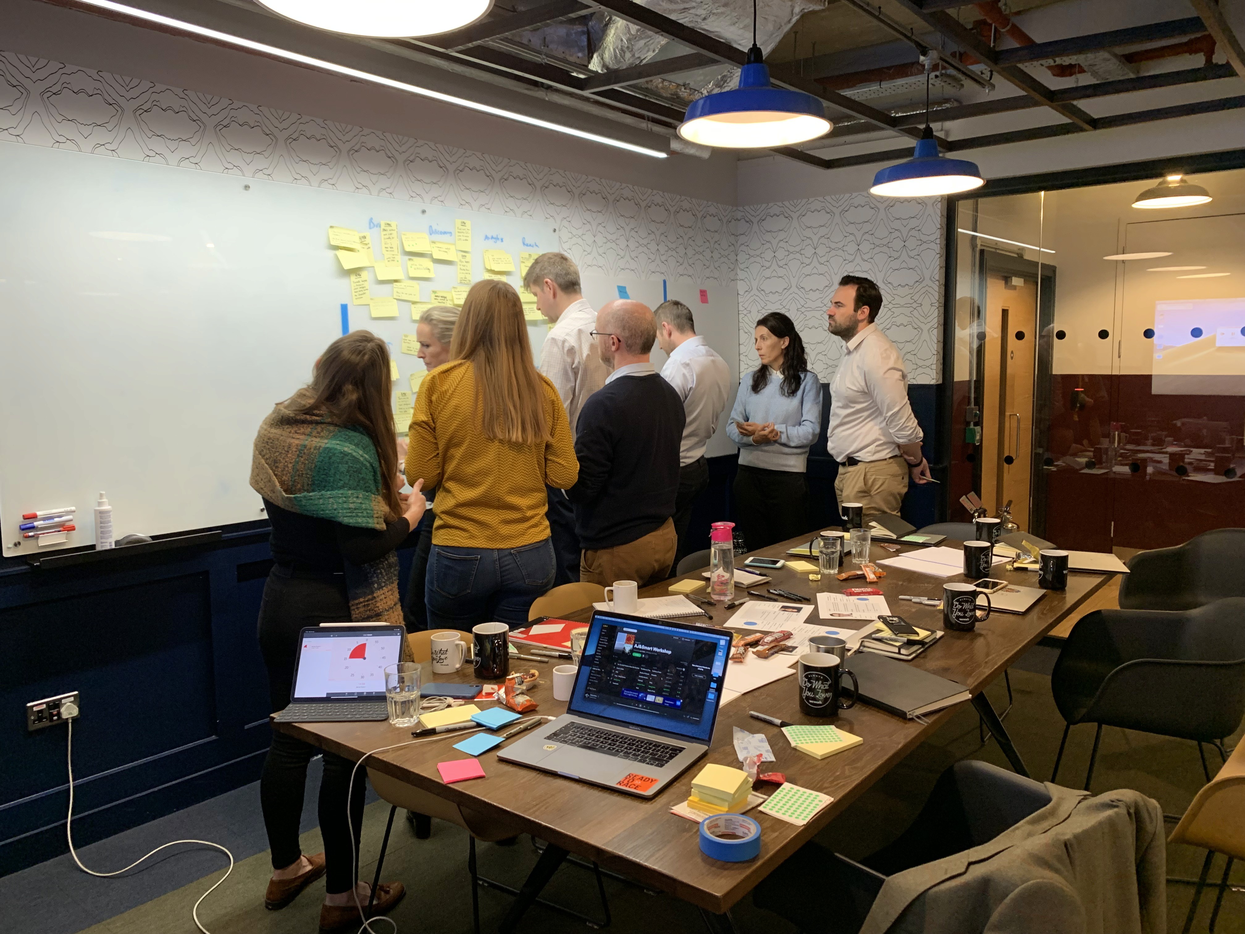
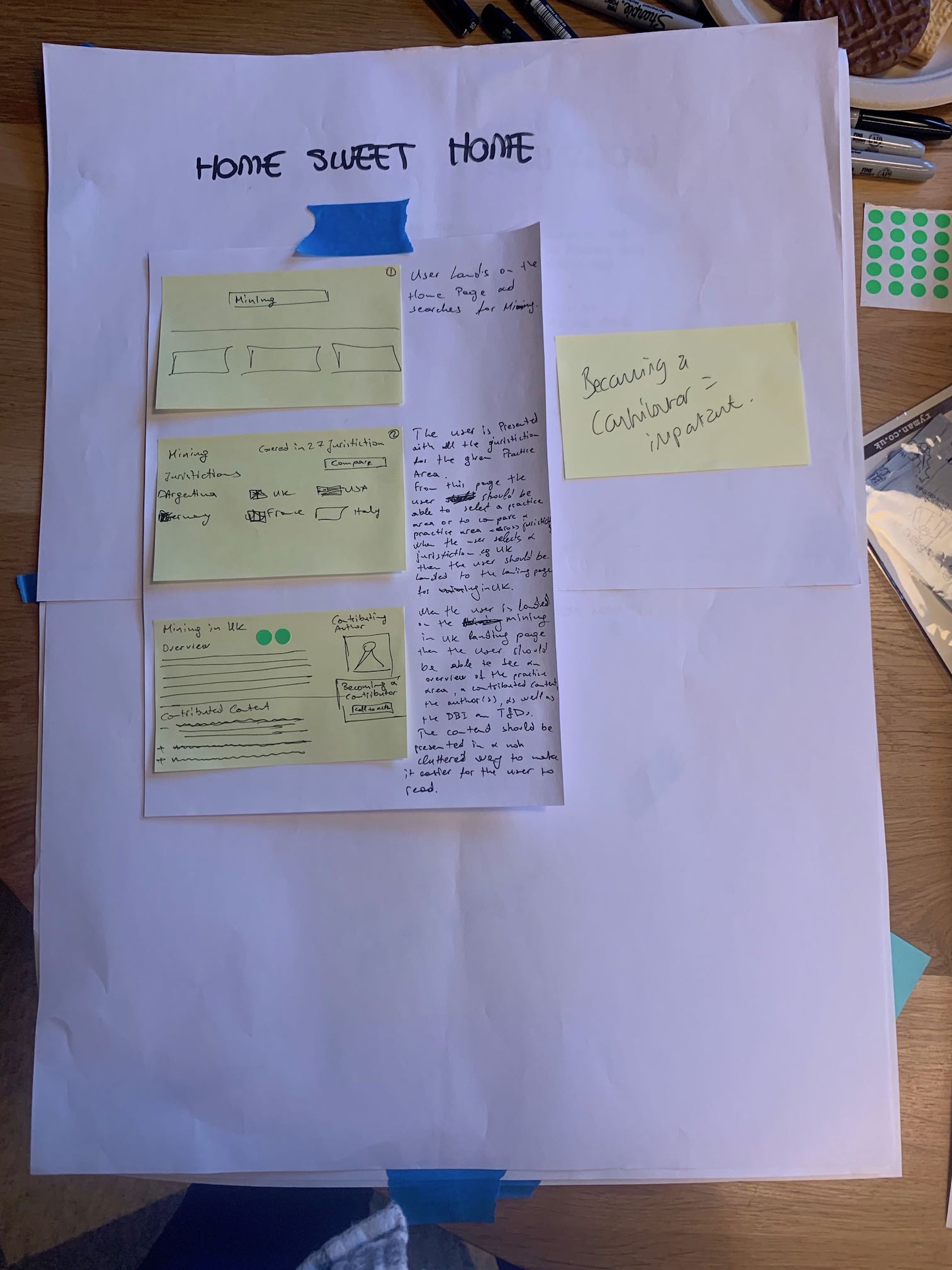
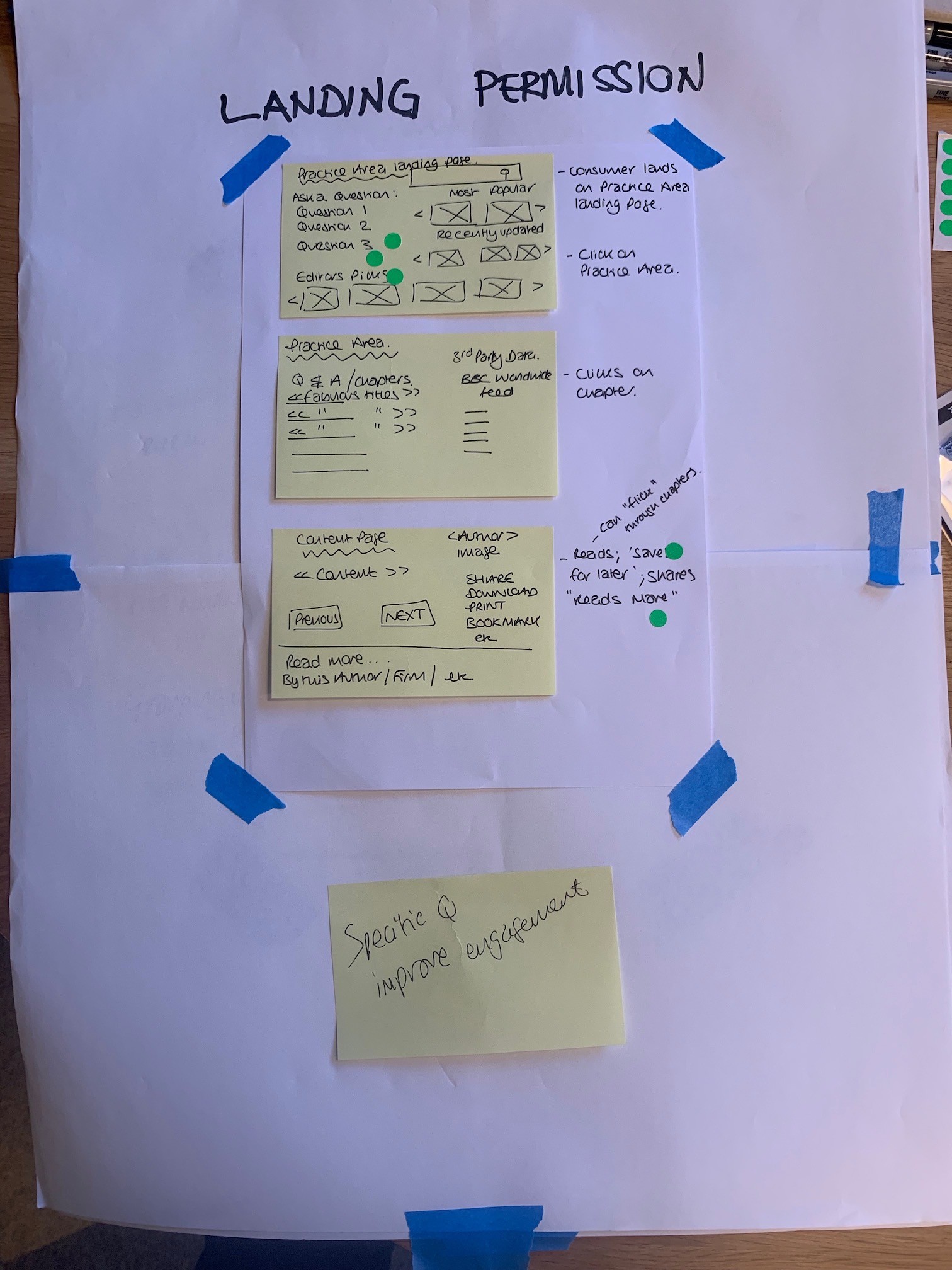
In the afternoon, the team transitioned to quick sketching sessions. Each team member individually produced rough sketches and wireframes based on the identified HMW statements. This allowed for rapid exploration of multiple design ideas.
Later, the team came together to review and critique the sketches, combining the best elements of each design. This collaborative approach fostered a diverse range of ideas while maintaining a focus on the end goal of improving usability.

Day 2: Exhibiting and Voting on Solutions
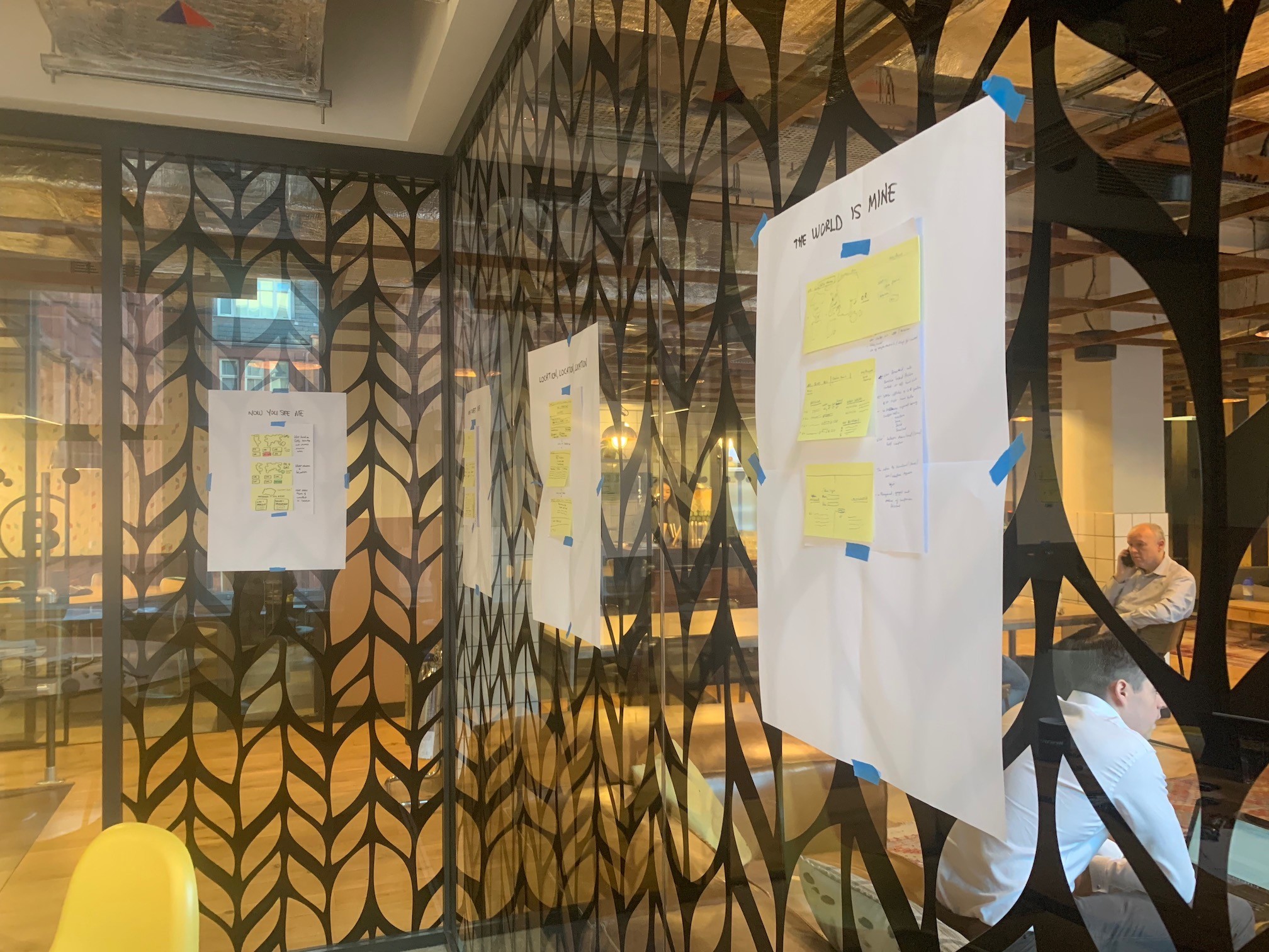
On the second day, the morning was spent refining the sketches and creating more detailed wireframes. Each team member selected their best solution to exhibit in the afternoon. Each solution was presented, and the team collectively voted on the most promising ideas.
The voting process considered factors such as feasibility, impact on usability, and alignment with user needs. The top-voted solutions were then combined and further refined to create a cohesive design direction.
Outcomes:
Prioritized Usability Issues: The HMW exercise helped identify and prioritize key usability issues, ensuring that the team focused on the most impactful improvements.
Diverse Design Exploration: Quick sketching allowed for a rapid exploration of various design ideas. This diversity ensured that the final solution considered multiple perspectives.
Collaborative Decision-Making: By exhibiting and voting on solutions, the team engaged in collaborative decision-making, ensuring that the final design direction had collective buy-in.
Refined Design Direction: The combination of top-voted solutions resulted in a refined design direction that addressed the identified usability issues in a comprehensive manner.

Next Steps: With the refined design direction in hand, the team is set to move into the prototyping and testing phase. This design sprint provided a solid foundation for improving the website's usability, and the iterative process will ensure that the final solution is user-centered and effective.
Day 1: Morning - "How Might We?" Exercise
The first morning was dedicated to the "How Might We?" (HMW) exercise. This involved a collaborative discussion to identify pain points and opportunities for improvement. The team brainstormed by posing questions like "How might we simplify the onboarding process?" or "How might we make navigation more intuitive?" The goal was to generate a wide range of problem statements.
The output of this session was a consolidated and prioritised list of HMW statements, providing a foundation for the rest of the sprint.

Day 1: Afternoon - Quick Sketching
In the afternoon, the team transitioned to quick sketching sessions. Each team member individually produced rough sketches and wireframes based on the identified HMW statements. This allowed for rapid exploration of multiple design ideas.
Later, the team came together to review and critique the sketches, combining the best elements of each design. This collaborative approach fostered a diverse range of ideas while maintaining a focus on the end goal of improving usability.

Day 2: Exhibiting and Voting on Solutions
On the second day, the morning was spent refining the sketches and creating more detailed wireframes. Each team member selected their best solution to exhibit in the afternoon. Each solution was presented, and the team collectively voted on the most promising ideas.
The voting process considered factors such as feasibility, impact on usability, and alignment with user needs. The top-voted solutions were then combined and further refined to create a cohesive design direction.

Outcomes:
Prioritized Usability Issues: The HMW exercise helped identify and prioritize key usability issues, ensuring that the team focused on the most impactful improvements.
Diverse Design Exploration: Quick sketching allowed for a rapid exploration of various design ideas. This diversity ensured that the final solution considered multiple perspectives.
Collaborative Decision-Making: By exhibiting and voting on solutions, the team engaged in collaborative decision-making, ensuring that the final design direction had collective buy-in.
Refined Design Direction: The combination of top-voted solutions resulted in a refined design direction that addressed the identified usability issues in a comprehensive manner.

Next Steps: With the refined design direction in hand, the team is set to move into the prototyping and testing phase. This design sprint provided a solid foundation for improving the website's usability, and the iterative process will ensure that the final solution is user-centered and effective.
Day 1: Morning - "How Might We?" Exercise
The first morning was dedicated to the "How Might We?" (HMW) exercise. This involved a collaborative discussion to identify pain points and opportunities for improvement. The team brainstormed by posing questions like "How might we simplify the onboarding process?" or "How might we make navigation more intuitive?" The goal was to generate a wide range of problem statements.
The output of this session was a consolidated and prioritised list of HMW statements, providing a foundation for the rest of the sprint.

Day 1: Afternoon - Quick Sketching
In the afternoon, the team transitioned to quick sketching sessions. Each team member individually produced rough sketches and wireframes based on the identified HMW statements. This allowed for rapid exploration of multiple design ideas.
Later, the team came together to review and critique the sketches, combining the best elements of each design. This collaborative approach fostered a diverse range of ideas while maintaining a focus on the end goal of improving usability.

Day 2: Exhibiting and Voting on Solutions
On the second day, the morning was spent refining the sketches and creating more detailed wireframes. Each team member selected their best solution to exhibit in the afternoon. Each solution was presented, and the team collectively voted on the most promising ideas.
The voting process considered factors such as feasibility, impact on usability, and alignment with user needs. The top-voted solutions were then combined and further refined to create a cohesive design direction.

Outcomes:
Prioritized Usability Issues: The HMW exercise helped identify and prioritize key usability issues, ensuring that the team focused on the most impactful improvements.
Diverse Design Exploration: Quick sketching allowed for a rapid exploration of various design ideas. This diversity ensured that the final solution considered multiple perspectives.
Collaborative Decision-Making: By exhibiting and voting on solutions, the team engaged in collaborative decision-making, ensuring that the final design direction had collective buy-in.
Refined Design Direction: The combination of top-voted solutions resulted in a refined design direction that addressed the identified usability issues in a comprehensive manner.

Next Steps: With the refined design direction in hand, the team is set to move into the prototyping and testing phase. This design sprint provided a solid foundation for improving the website's usability, and the iterative process will ensure that the final solution is user-centered and effective.





Let's get to know each other.
Let's get to know each other.
Let's get to know each other.
Let's get to know each other.
Let's get to know each other.
Copyright 2024 by Yavuz Yilmaz
Copyright 2024 by Yavuz Yilmaz
Copyright 2024 by Yavuz Yilmaz
Copyright 2024 by Yavuz Yilmaz
Copyright 2024 by Yavuz Yilmaz
Chambers & Partners
Role
UX/UI Designer
Industry
E-commerce, Listing
Time
2019
2-Day design sprint


Overview
Our website has been live for some time, but user feedback and analytics indicate issues in terms of usability. To address this, we organised a 2-day design sprint with the primary goal of understanding and addressing key usability issues.


Day 1: Morning - "How Might We?" Exercise
The first morning was dedicated to the "How Might We?" (HMW) exercise. This involved a collaborative discussion to identify pain points and opportunities for improvement. The team brainstormed by posing questions like "How might we simplify the onboarding process?" or "How might we make navigation more intuitive?" The goal was to generate a wide range of problem statements.
The output of this session was a consolidated and prioritised list of HMW statements, providing a foundation for the rest of the sprint.

Day 1: Afternoon - Quick Sketching
In the afternoon, the team transitioned to quick sketching sessions. Each team member individually produced rough sketches and wireframes based on the identified HMW statements. This allowed for rapid exploration of multiple design ideas.
Later, the team came together to review and critique the sketches, combining the best elements of each design. This collaborative approach fostered a diverse range of ideas while maintaining a focus on the end goal of improving usability.

Day 2: Exhibiting and Voting on Solutions
On the second day, the morning was spent refining the sketches and creating more detailed wireframes. Each team member selected their best solution to exhibit in the afternoon. Each solution was presented, and the team collectively voted on the most promising ideas.
The voting process considered factors such as feasibility, impact on usability, and alignment with user needs. The top-voted solutions were then combined and further refined to create a cohesive design direction.

Outcomes:
Prioritized Usability Issues: The HMW exercise helped identify and prioritize key usability issues, ensuring that the team focused on the most impactful improvements.
Diverse Design Exploration: Quick sketching allowed for a rapid exploration of various design ideas. This diversity ensured that the final solution considered multiple perspectives.
Collaborative Decision-Making: By exhibiting and voting on solutions, the team engaged in collaborative decision-making, ensuring that the final design direction had collective buy-in.
Refined Design Direction: The combination of top-voted solutions resulted in a refined design direction that addressed the identified usability issues in a comprehensive manner.

Next Steps: With the refined design direction in hand, the team is set to move into the prototyping and testing phase. This design sprint provided a solid foundation for improving the website's usability, and the iterative process will ensure that the final solution is user-centered and effective.


sdfg