Introducing paywall to a popular newspaper blog
Auction Technology Group
Role
UX/UI Designer
Industry
News Blog, UX
Time
2017


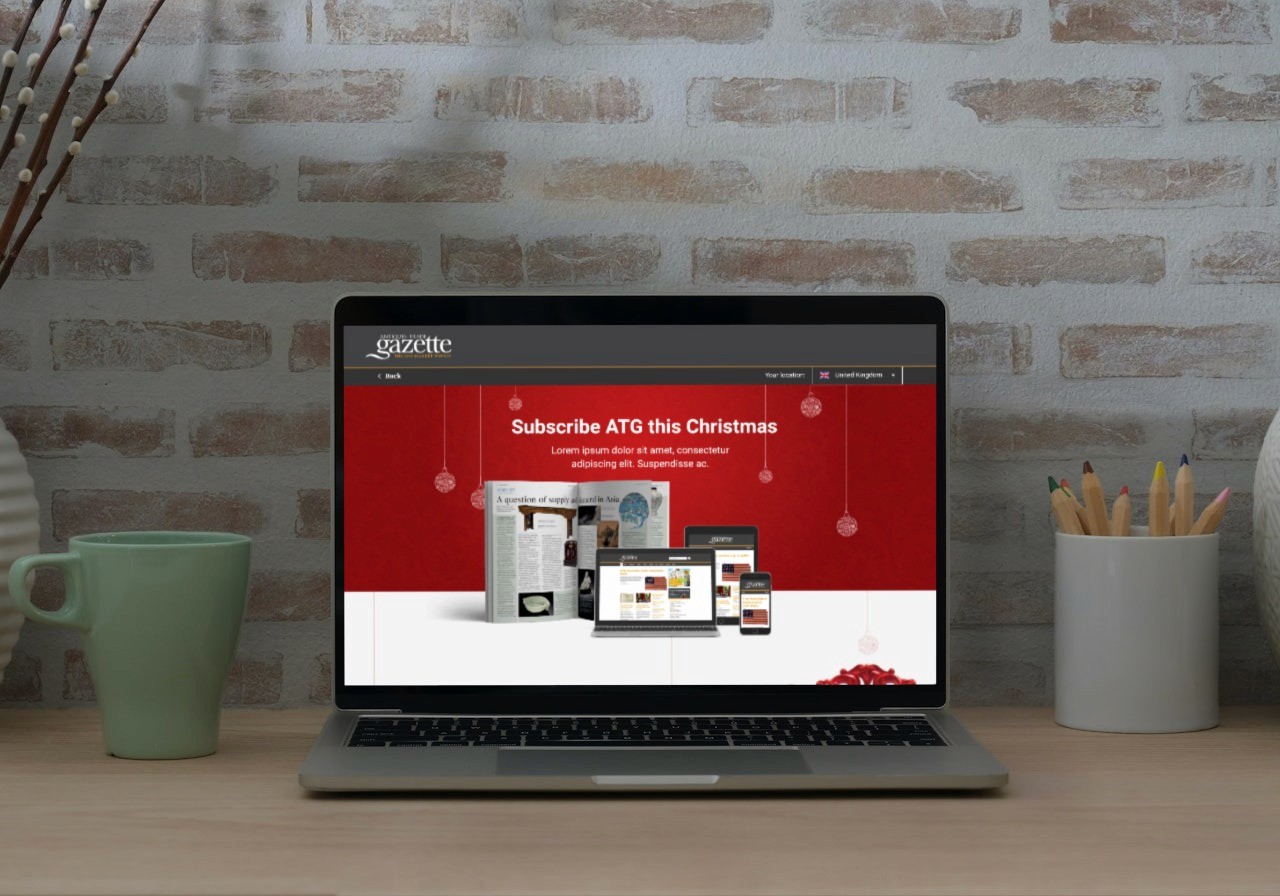
In 2016, Auction Technology Group decided introduce paywall to their long running free and premium art & antiques blog antiquetradegazette.com and serve provide users with free and paid content based on their subscription levels.
Although redesign of the website wasn't in the scope, I volunteered to redesign the website, so we would eliminate all the issues that are present with the current website and offer a premium experience.
The project did not have budget nor the time for any research or interviews. But, long time running website had loyal readers who were providing feedback. Compiling and analysing feedback confirmed our assumptions regarding usability issues, accessibility and information architecture.
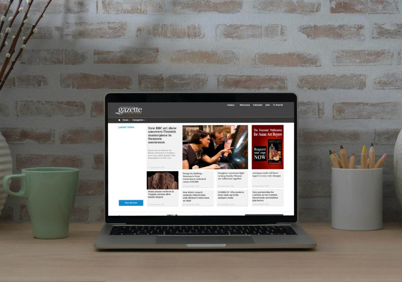
Armed with this information first I started working on paywall user flows. Once the designs were completed I enhanced simple diagrams with actual designs so that developers would be able to recognise and follow designs more efficiently.
—





Approach
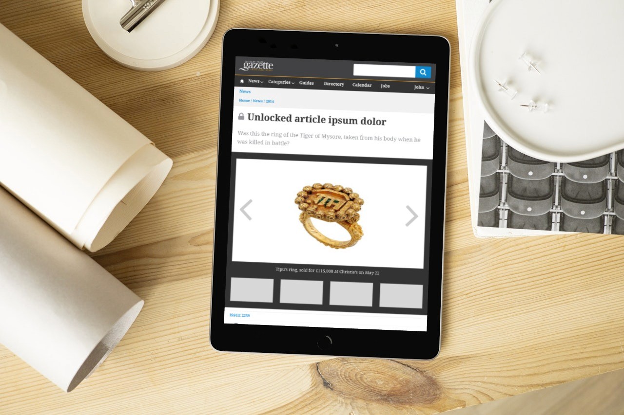
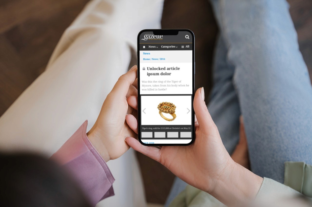
Before creating any page design, I first designed a UI library based on Atomic Design principles which in turn helped me focus on information architecture while quickly realising page designs. This also helped developers to start working on components while I was working on different page templates for home, category, search results and articles.
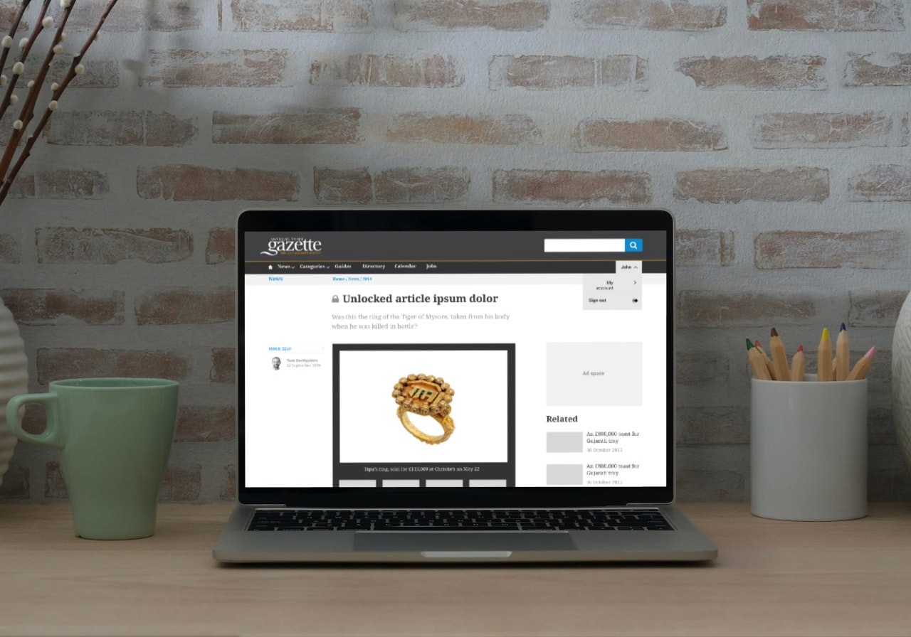
Project consisted of several page designs for different sections like news, auction calendar, directory and user account. All pages included adequate amount of advertising areas which are strategically placed so that they wouldn't interfere with the experience while creating extra income for the website.
Result and learnings
Once the website and paywall was launched first user feedback showed that they were apprehensive however, over the time it turned out to be a success. My designs are still live at antiquetradegazette.com after 7 long years.
While I am a strong advocate for understanding users and the market before taking on any major redesign projects, this project proved us that if we have enough data/information about your users, we can understand users to undertake such a project.
Are you planning on taking on a redesign project and you don't want to make the mistake of redesigning it just for the sake of it? Take your first step to understand your users more, give me a shout. Let's discuss how you can make the most out of the return on your investment.



Let's get to know each other.
Let's get to know each other.
Let's get to know each other.
Let's get to know each other.
Let's get to know each other.
Copyright 2024 by Yavuz Yilmaz
Copyright 2024 by Yavuz Yilmaz
Copyright 2024 by Yavuz Yilmaz
Copyright 2024 by Yavuz Yilmaz
Copyright 2024 by Yavuz Yilmaz
Auction Technology Group
Role
UX/UI Designer
Industry
News Blog, UX
Time
2017
Introducing paywall to a popular newspaper blog


Overview
In 2016, Auction Technology Group decided introduce paywall to their long running free and premium art & antiques blog antiquetradegazette.com and serve provide users with free and paid content based on their subscription levels.
Although redesign of the website wasn't in the scope, I volunteered to redesign the website, so we would eliminate all the issues that are present with the current website and offer a premium experience.
The project did not have budget nor the time for any research or interviews. But, long time running website had loyal readers who were providing feedback. Compiling and analysing feedback confirmed our assumptions regarding usability issues, accessibility and information architecture.
Armed with this information first I started working on paywall user flows. Once the designs were completed I enhanced simple diagrams with actual designs so that developers would be able to recognise and follow designs more efficiently.
—


Approach
Before creating any page design, I first designed a UI library based on Atomic Design principles which in turn helped me focus on information architecture while quickly realising page designs. This also helped developers to start working on components while I was working on different page templates for home, category, search results and articles.
Project consisted of several page designs for different sections like news, auction calendar, directory and user account. All pages included adequate amount of advertising areas which are strategically placed so that they wouldn't interfere with the experience while creating extra income for the website.
Result and learnings
Once the website and paywall was launched first user feedback showed that they were apprehensive however, over the time it turned out to be a success. My designs are still live at antiquetradegazette.com after 7 long years.
While I am a strong advocate for understanding users and the market before taking on any major redesign projects, this project proved us that if we have enough data/information about your users, we can understand users to undertake such a project.
Are you planning on taking on a redesign project and you don't want to make the mistake of redesigning it just for the sake of it? Take your first step to understand your users more, give me a shout. Let's discuss how you can make the most out of the return on your investment.


sdfg