Transforming Digital Auctions: The ATG Marketplace Evolution
Auction Technology Group
Role
UX/UI Designer
Industry
E-commerce, Auction Platform
Time
2017
Overview
Since 2002, Auction Technology Group (ATG) has been a cornerstone of the online auction industry, managing four distinct marketplaces across 12 verticals in Art, Antiques, Industrial, and Commercial sectors. With 13,000 annual auctions, ATG faced the challenge of modernizing their digital experience while maintaining the integrity and complexity of traditional auction processes.
The Challenge
We identified two critical issues affecting user engagement:
Complex onboarding processes, including mandatory Know Your Customer (KYC) verification, leading to significant user drop-off
Overwhelming information architecture that deterred potential bidders from participating
Multiple platforms (the-saleroom.com, i-bidder.com, bidspotter.co.uk, bidspotter.com) requiring consistent user experience
My Role & Impact
As the UX/UI Designer, I focused on:
User Journey Mapping
Information Architecture
Cross-platform Design Consistency
Conversion Flow Optimization
Responsive Design Implementation


The Process
1. User Journey Analysis
Started with a comprehensive mapping of the current state:
Identified critical drop-off points in the user journey
Analyzed unnecessary steps in registration and bidding
Documented opportunities for improvement across all platform sections
Created a streamlined path from discovery to successful bidding
2. Information Architecture Redesign
Developed a new structure focusing on:
Categorical organization of auction information
Simplified product discovery
Intuitive navigation patterns
Consistent cross-platform experience
3. Wireframing & Prototyping
Employed an iterative design process:
Created initial sketches for key user flows
Developed low-fidelity wireframes using Sketch
Incorporated marketing team's content requirements
Conducted 4 rounds of user testing
Refined designs based on user feedback
4. UI Design Implementation
Built a cohesive design system that:
Aligned with brand values
Emphasized simplicity and clarity
Followed e-commerce best practices
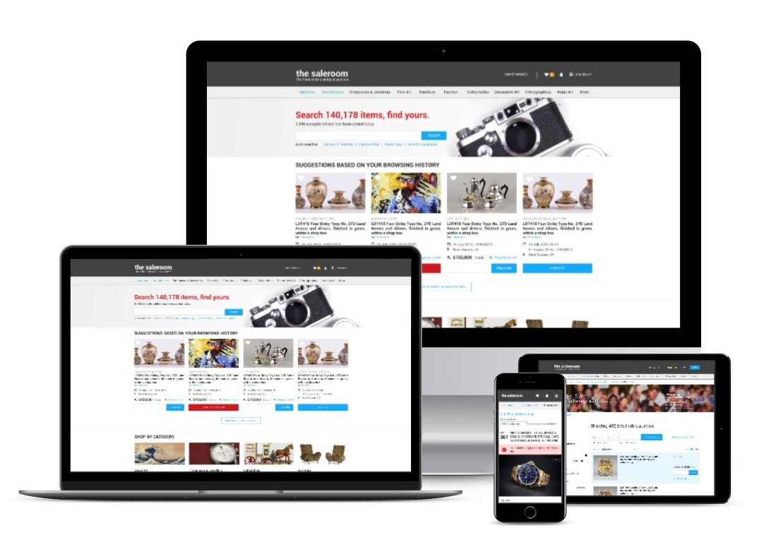
Ensured responsive design across all devices
Created a fresh, light visual style
Key Improvements
Enhanced Product Discovery
Redesigned homepage for better auction visibility
Improved search results presentation
Optimized catalogue and category pages
Restructured lot detail pages for clarity
Streamlined Conversion Flows
Simplified registration process
Reduced friction in auction participation
Created intuitive bidding interfaces
Implemented anxiety-reducing design elements
Cross-Platform Consistency
Unified design language across all platforms
Standardized user interactions
Maintained platform-specific requirements while ensuring cohesive experience
Results & Impact
The redesign successfully launched across all four platforms:
Key Learnings
Balancing traditional auction complexity with modern UX principles
Importance of data-driven design decisions through CRO
Value of stakeholder collaboration (users, auction houses, internal teams)
Benefits of consistent cross-platform design systems
The Bigger Picture
This transformation wasn't just about improving interfaces – it was about modernizing the traditional auction experience for the digital age while maintaining the trust and security required in high-value transactions. The success across multiple platforms demonstrated the scalability and effectiveness of our user-centered approach.
The Process
1. User Journey Analysis
Started with a comprehensive mapping of the current state:
Identified critical drop-off points in the user journey
Analyzed unnecessary steps in registration and bidding
Documented opportunities for improvement across all platform sections
Created a streamlined path from discovery to successful bidding
2. Information Architecture Redesign
Developed a new structure focusing on:
Categorical organization of auction information
Simplified product discovery
Intuitive navigation patterns
Consistent cross-platform experience
3. Wireframing & Prototyping
Employed an iterative design process:
Created initial sketches for key user flows
Developed low-fidelity wireframes using Sketch
Incorporated marketing team's content requirements
Conducted 4 rounds of user testing
Refined designs based on user feedback
4. UI Design Implementation
Built a cohesive design system that:
Aligned with brand values
Emphasized simplicity and clarity
Followed e-commerce best practices
Ensured responsive design across all devices
Created a fresh, light visual style
Key Improvements
Enhanced Product Discovery
Redesigned homepage for better auction visibility
Improved search results presentation
Optimized catalogue and category pages
Restructured lot detail pages for clarity
Streamlined Conversion Flows
Simplified registration process
Reduced friction in auction participation
Created intuitive bidding interfaces
Implemented anxiety-reducing design elements
Cross-Platform Consistency
Unified design language across all platforms
Standardized user interactions
Maintained platform-specific requirements while ensuring cohesive experience
Results & Impact
The redesign successfully launched across all four platforms:
Key Learnings
Balancing traditional auction complexity with modern UX principles
Importance of data-driven design decisions through CRO
Value of stakeholder collaboration (users, auction houses, internal teams)
Benefits of consistent cross-platform design systems
The Bigger Picture
This transformation wasn't just about improving interfaces – it was about modernizing the traditional auction experience for the digital age while maintaining the trust and security required in high-value transactions. The success across multiple platforms demonstrated the scalability and effectiveness of our user-centered approach.


Client testimonials
Yavuz puts himself into the hearts and minds of the customer, overcoming barriers and delivering the most engaging yet simplistic experiences. He is a pleasure to work with due to his collaborative work ethic and optimistic outlook. I look forward to working with him again.
Marika Clemow, CVP @ ATG
Yavuz puts himself into the hearts and minds of the customer, overcoming barriers and delivering the most engaging yet simplistic experiences. He is a pleasure to work with due to his collaborative work ethic and optimistic outlook. I look forward to working with him again.
Marika Clemow, CVP @ ATG
Let's get to know each other.
Let's get to know each other.
Let's get to know each other.
Let's get to know each other.
Let's get to know each other.
Copyright 2024 by Yavuz Yilmaz
Copyright 2024 by Yavuz Yilmaz
Copyright 2024 by Yavuz Yilmaz
Copyright 2024 by Yavuz Yilmaz
Copyright 2024 by Yavuz Yilmaz
Auction Technology Group
Role
UX/UI Designer
Industry
E-commerce, Auction Platform
Time
2017
Transforming Digital Auctions: The ATG Marketplace Evolution
Overview
Overview
Since 2002, Auction Technology Group (ATG) has been a cornerstone of the online auction industry, managing four distinct marketplaces across 12 verticals in Art, Antiques, Industrial, and Commercial sectors. With 13,000 annual auctions, ATG faced the challenge of modernizing their digital experience while maintaining the integrity and complexity of traditional auction processes.
The Challenge
We identified two critical issues affecting user engagement:
Complex onboarding processes, including mandatory Know Your Customer (KYC) verification, leading to significant user drop-off
Overwhelming information architecture that deterred potential bidders from participating
Multiple platforms (the-saleroom.com, i-bidder.com, bidspotter.co.uk, bidspotter.com) requiring consistent user experience
My Role & Impact
As the UX/UI Designer, I focused on:
User Journey Mapping
Information Architecture
Cross-platform Design Consistency
Conversion Flow Optimization
Responsive Design Implementation
The Process
1. User Journey Analysis
Started with a comprehensive mapping of the current state:
Identified critical drop-off points in the user journey
Analyzed unnecessary steps in registration and bidding
Documented opportunities for improvement across all platform sections
Created a streamlined path from discovery to successful bidding
2. Information Architecture Redesign
Developed a new structure focusing on:
Categorical organization of auction information
Simplified product discovery
Intuitive navigation patterns
Consistent cross-platform experience
3. Wireframing & Prototyping
Employed an iterative design process:
Created initial sketches for key user flows
Developed low-fidelity wireframes using Sketch
Incorporated marketing team's content requirements
Conducted 4 rounds of user testing
Refined designs based on user feedback
4. UI Design Implementation
Built a cohesive design system that:
Aligned with brand values
Emphasized simplicity and clarity
Followed e-commerce best practices
Ensured responsive design across all devices
Created a fresh, light visual style
Key Improvements
Enhanced Product Discovery
Redesigned homepage for better auction visibility
Improved search results presentation
Optimized catalogue and category pages
Restructured lot detail pages for clarity
Streamlined Conversion Flows
Simplified registration process
Reduced friction in auction participation
Created intuitive bidding interfaces
Implemented anxiety-reducing design elements
Cross-Platform Consistency
Unified design language across all platforms
Standardized user interactions
Maintained platform-specific requirements while ensuring cohesive experience
Results & Impact
The redesign successfully launched across all four platforms:
Key Learnings
Balancing traditional auction complexity with modern UX principles
Importance of data-driven design decisions through CRO
Value of stakeholder collaboration (users, auction houses, internal teams)
Benefits of consistent cross-platform design systems
The Bigger Picture
This transformation wasn't just about improving interfaces – it was about modernizing the traditional auction experience for the digital age while maintaining the trust and security required in high-value transactions. The success across multiple platforms demonstrated the scalability and effectiveness of our user-centered approach.
sdfg