Revolutionising Volunteer Management: The Assemble Story
Dutysheet Ltd
Role
UX/UI Designer
Industry
SaaS, Volunteering
Time
2017
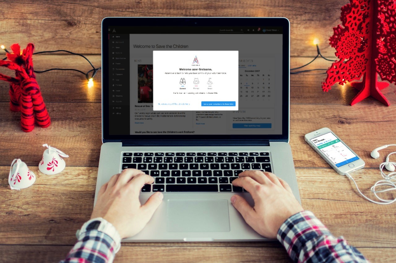


In 2017, we embarked on a mission to transform Assemble, a promising Volunteer Management System, from a basic SaaS platform into a powerhouse solution for the UK's charitable sector. What started as a simple application with essential functions evolved into the go-to platform for high-street charities across the United Kingdom.
The Challenge
While Assemble had successfully attracted initial customers, including a prominent high-street charity, the platform was struggling with fundamental UX issues:
An off-the-shelf CSS framework that limited user experience
Inconsistent UI elements and features across the platform
Disorganized content architecture hampering navigation
Limited scalability for white-label applications
My Role & Team Composition
As the lead UX/UI Designer, I wore multiple hats:
UX Design & Research Lead
Workshop Facilitator
UI System Architect
User Testing Coordinator
Working alongside:
4 dedicated developers
2 customer stakeholders
2 product owners (CEO & CTO)




The Process
1. Discovery & Research
I initiated the project with comprehensive stakeholder interviews, focusing on:
Business objectives from product owners
Real-world volunteering insights from customer stakeholders
Detailed UX audit against industry best practices
2. Foundation Building
Created a robust UI library and design guidelines that:
Established consistent design patterns
Improved accessibility standards
Developed a flexible foundation for white-label solutions
Introduced cohesive visual language
3. Structural Redesign
Implemented a new information architecture featuring:
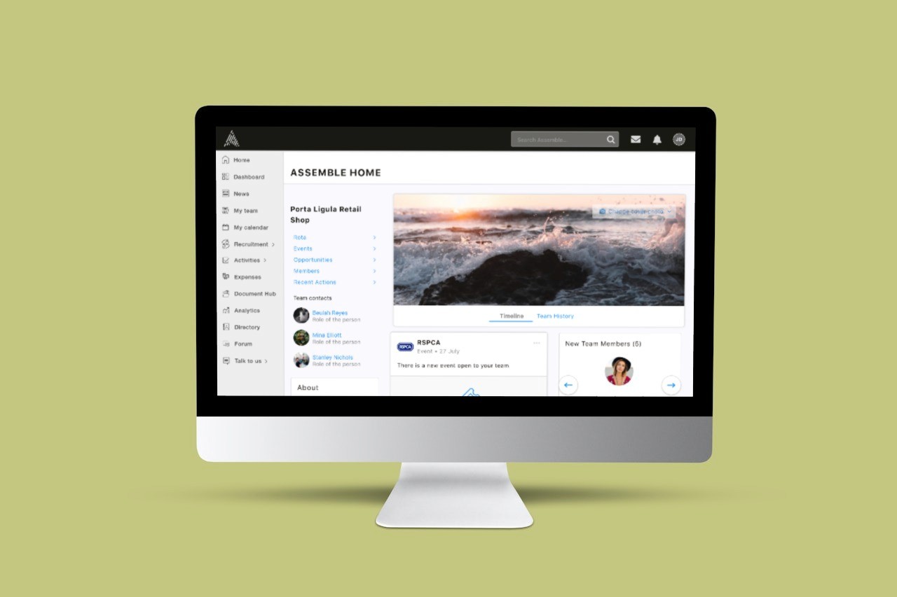
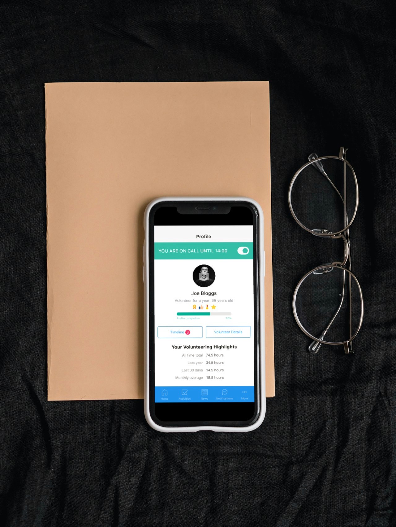
Distinct menu categorization (main menu & user menu)
Intuitive navigation with custom iconography
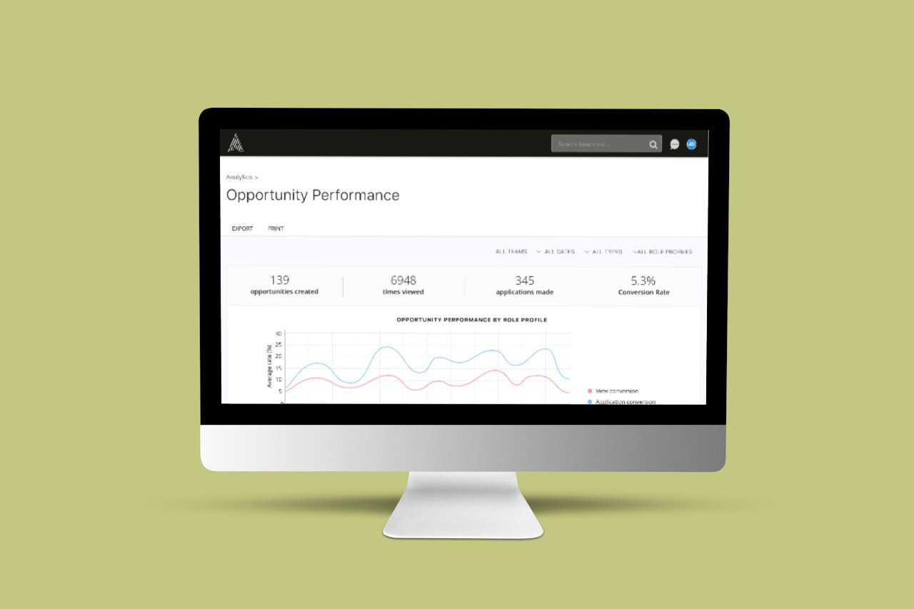
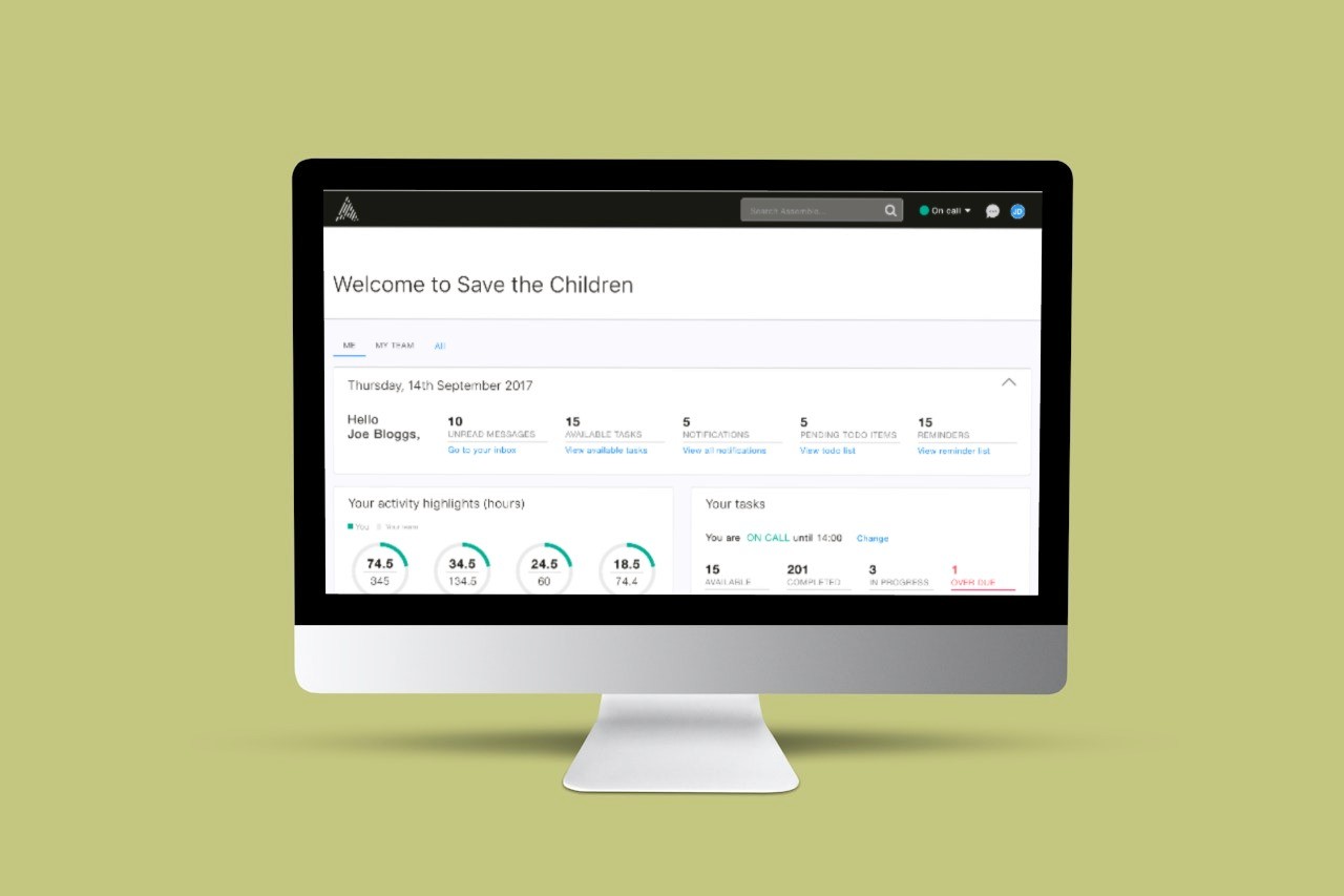
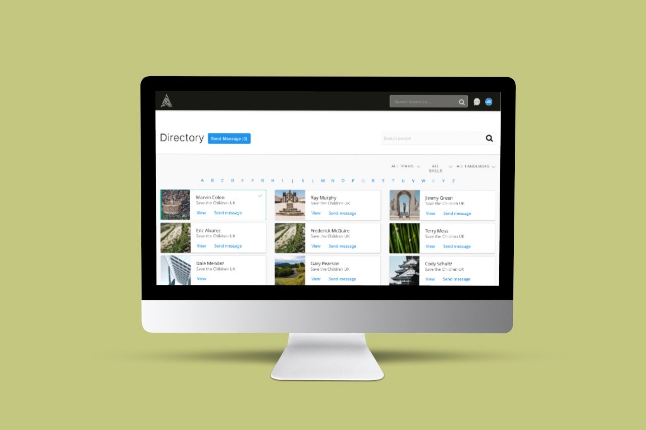
Consistent page layouts across the platform
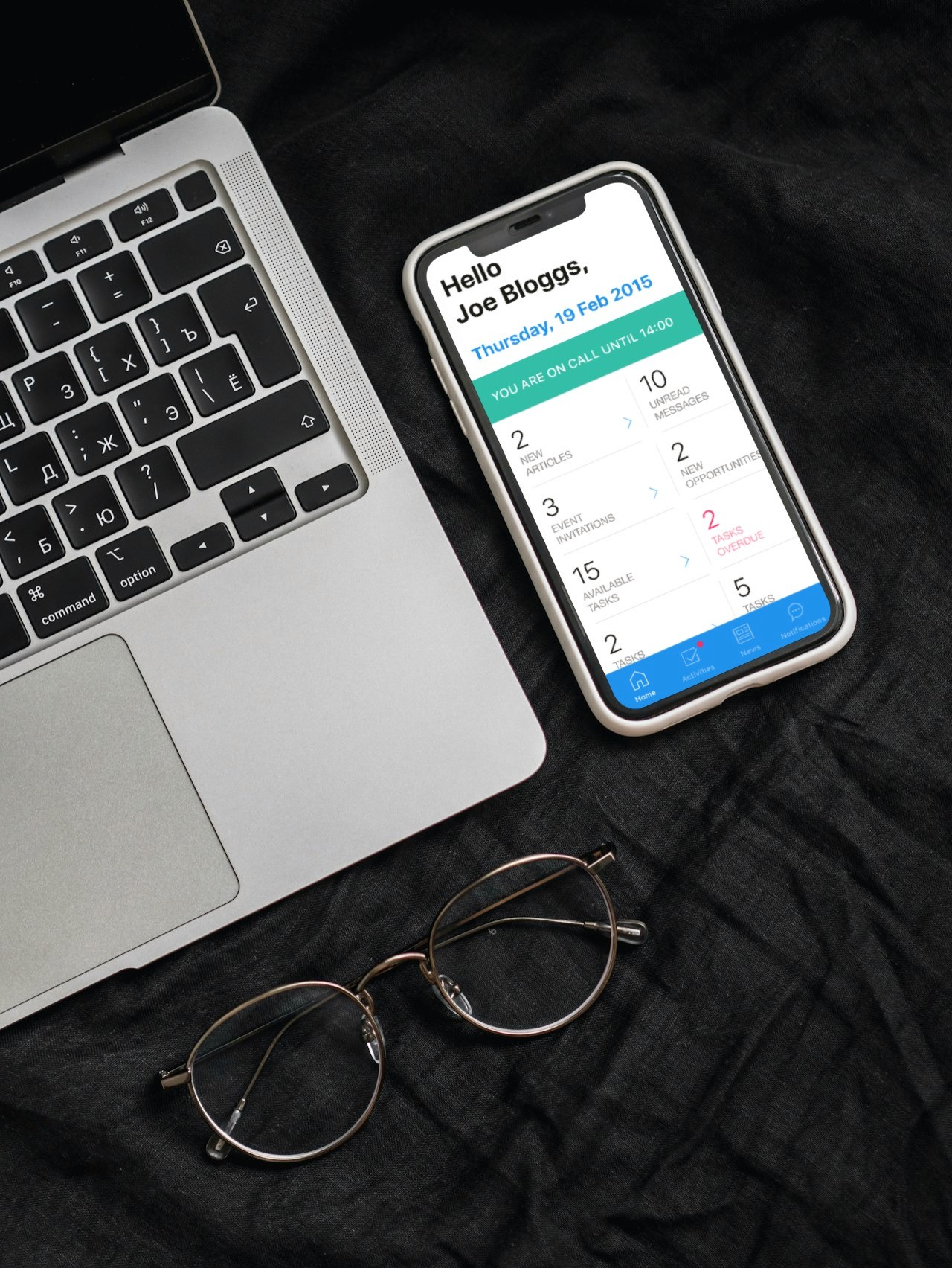
Desktop-first approach with complementary mobile app solution
4. Iterative Design Process
Employed a collaborative design approach:
Regular workshops with stakeholders
Detailed user flow mapping
Low-fidelity prototyping
Guerrilla testing with users
Rapid iteration based on feedback
Impact & Results
The 8-month transformation yielded remarkable results:
Successful adoption by major UK high-street charities
Positive user testing feedback on new interface
Platform acquisition by Access, validating our design decisions
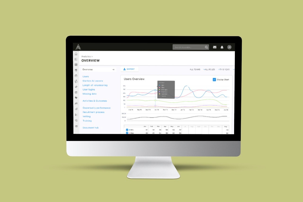
Improved user engagement and reduced learning curve
Key Learnings
This project provided invaluable insights into:
Building scalable design systems
Balancing stakeholder needs with user requirements
Managing complex UX transformations
Leading cross-functional teams
Creating lasting impact through thoughtful design
Tools & Technologies
Design: Sketch, Zeplin
Collaboration: Miro
Prototyping: Overflow, Invision
User Testing: InVision
The Bigger Picture
The Assemble transformation wasn't just about improving an interface – it was about creating a platform that could scale with the growing demands of the UK's charitable sector. The project's success, culminating in the platform's acquisition, validated our user-centered approach and demonstrated the power of thoughtful UX design in driving business outcomes.






Client testimonials
I've had the pleasure of working with Yavuz for the past 9 months during which time he has been focussed on our SaaS product completely redesigning the UI and approaching a number of new features from a UX perspective. Yavuz is a reliable, punctual, individual who is a master at his craft of UI and UX design. I wouldn't hesitate to recommend him for similar projects.
Ben Hayes, CEO @ Assemble / DutySheet
His ability to understand the problems we were trying to solve, work with all stakeholders ranging from developers to directors, research and design really beautiful and modern user experience is unparalleled. No detail too small, no complex scenario unworkable. He would work methodically, with good humour but above all, with passion and pride for his work.
Let's get to know each other.
Let's get to know each other.
Let's get to know each other.
Let's get to know each other.
Let's get to know each other.
Copyright 2024 by Yavuz Yilmaz
Copyright 2024 by Yavuz Yilmaz
Copyright 2024 by Yavuz Yilmaz
Copyright 2024 by Yavuz Yilmaz
Copyright 2024 by Yavuz Yilmaz
Dutysheet Ltd
Role
UX/UI Designer
Industry
SaaS, Volunteering
Time
2017
Revolutionising Volunteer Management: The Assemble Story


Overview
In 2017, we embarked on a mission to transform Assemble, a promising Volunteer Management System, from a basic SaaS platform into a powerhouse solution for the UK's charitable sector. What started as a simple application with essential functions evolved into the go-to platform for high-street charities across the United Kingdom.
The Challenge
While Assemble had successfully attracted initial customers, including a prominent high-street charity, the platform was struggling with fundamental UX issues:
An off-the-shelf CSS framework that limited user experience
Inconsistent UI elements and features across the platform
Disorganized content architecture hampering navigation
Limited scalability for white-label applications
My Role & Team Composition
As the lead UX/UI Designer, I wore multiple hats:
UX Design & Research Lead
Workshop Facilitator
UI System Architect
User Testing Coordinator
Working alongside:
4 dedicated developers
2 customer stakeholders
2 product owners (CEO & CTO)


The Process
1. Discovery & Research
I initiated the project with comprehensive stakeholder interviews, focusing on:
Business objectives from product owners
Real-world volunteering insights from customer stakeholders
Detailed UX audit against industry best practices
2. Foundation Building
Created a robust UI library and design guidelines that:
Established consistent design patterns
Improved accessibility standards
Developed a flexible foundation for white-label solutions
Introduced cohesive visual language
3. Structural Redesign
Implemented a new information architecture featuring:
Distinct menu categorization (main menu & user menu)
Intuitive navigation with custom iconography
Consistent page layouts across the platform
Desktop-first approach with complementary mobile app solution
4. Iterative Design Process
Employed a collaborative design approach:
Regular workshops with stakeholders
Detailed user flow mapping
Low-fidelity prototyping
Guerrilla testing with users
Rapid iteration based on feedback
Impact & Results
The 8-month transformation yielded remarkable results:
Successful adoption by major UK high-street charities
Positive user testing feedback on new interface
Platform acquisition by Access, validating our design decisions
Improved user engagement and reduced learning curve
Key Learnings
This project provided invaluable insights into:
Building scalable design systems
Balancing stakeholder needs with user requirements
Managing complex UX transformations
Leading cross-functional teams
Creating lasting impact through thoughtful design
Tools & Technologies
Design: Sketch, Zeplin
Collaboration: Miro
Prototyping: Overflow, Invision
User Testing: InVision
The Bigger Picture
The Assemble transformation wasn't just about improving an interface – it was about creating a platform that could scale with the growing demands of the UK's charitable sector. The project's success, culminating in the platform's acquisition, validated our user-centered approach and demonstrated the power of thoughtful UX design in driving business outcomes.


sdfg